kingpin.ai
kingpin.ai
kingpin.ai
AI-Powered B2B Retail SaaS
AI-Powered B2B Retail SaaS
|
|
Desktop & mobile Web
Desktop & mobile


decorative footage concept
about
about
Kingpin is a B2B SaaS platform built for brands, distributors, and retailers, helping them find and connect with each other in a much easier way.
Kingpin is a B2B SaaS platform built for brands, distributors, and retailers, helping them find and connect with each other in a much easier way.
Kingpin is a B2B SaaS platform built for brands, distributors, and retailers, helping them find and connect with each other in a much easier way.
AI-powered search and filtering replaces the manual process of browsing, comparing, filtering, and contacting distributors if you’re a brand.
The product’s AI assistance covers the full flow: from creating a profile in just a couple of clicks by entering your brand’s URL, to generating a cover letter and communicating with distributors inside the service.
web footage concept
Scope and scale
Scope and scale
Scope and scale
domain
B2B Retail | SaaS | AI
B2B Retail | SaaS | AI
links
Project numbers
▪ 0 to 1 launch
▪ 500+ B2B teams audience
▪ 85% faster processing (compared to non-AI service)
▪ $3.5M raised
▪ 0 to 1 launch
▪ 500+ B2B teams audience
▪ 85% faster processing (compared to non-AI service)
▪ $3.5M raised
platform
▪ Desktop web services
▪ Mobile cross-platform app
▪ Desktop web services
▪ Mobile cross-platform app
links
impact
impact
Designed the product from scratch: cross-platform navigation, full desktop/mobile UX flows, comprehensive UI across the entire journey, UI style guide, and design system foundation.
Designed the product from scratch: cross-platform navigation, full desktop/mobile UX flows, comprehensive UI across the entire journey, UI style guide, and design system foundation.
■ Led product design for AI-driven sales platform connecting brands to retailers and distributors.
■ Designed the core UX, streamlining complex B2B distribution workflows for new users.
■ Simplified the initial sales funnel and data visualization dashboards.
■ Built scalable design system, cutting front-end dev costs by 30%
■ Improved user task completion rates across the user flow.
■ Created product illustrations for marketing purposes.
■ Built the product website from scratch with Framer.


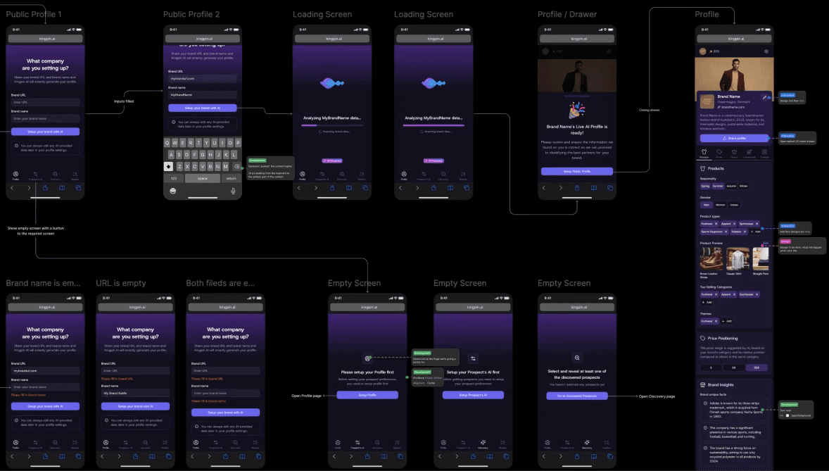
profile setup flow draft prototype
profile setup flow draft prototype
challenge
challenge
The main goal was to convert complex features and screens overloaded with input fields into a simple, intuitive 3-step flow for first-time users, consistent across the entire product and marketing positioning.
The main goal was to convert complex features and screens overloaded with input fields into a simple, intuitive 3-step flow for first-time users, consistent across the entire product and marketing positioning.
The main goal was to convert complex features and screens overloaded with input fields into a simple, intuitive 3-step flow for first-time users, consistent across the entire product and marketing positioning.
Each step contains dozens of AI-predefined fields suggesting the most relevant data. Another challenge was preserving consistency in mobile and desktop screen hierarchies using similar design system components to reduce dev costs.
Development had very tight deadlines, where every new or customized component posed a problem. I challenged each UI section, balancing optimal UX with development costs.
process
process
The process integrated feature development and information display with UX simplification. These two streams mutually influenced and adapted to each other, maximizing functionality while preserving intuitive UX.
The process integrated feature development and information display with UX simplification. These two streams mutually influenced and adapted to each other, maximizing functionality while preserving intuitive UX.
The process integrated feature development and information display with UX simplification. These two streams mutually influenced and adapted to each other, maximizing functionality while preserving intuitive UX.
The classic conflict between two often opposing requirements. One side demands maximum detailed functionality, text, and data volume. Meanwhile to get a competitive UX we need maintaining reasonable user cognitive load, grouping information, and minimizing required actions.
The classic conflict between two often opposing requirements. One side demands maximum detailed functionality, text, and data volume. Meanwhile to get a competitive UX we need maintaining reasonable user cognitive load, grouping information, and minimizing required actions.
My approach is always to strike a balance in this conflict, incorporating arguments from both business and user experience perspectives. You can’t pick just one side and design solely for user needs: the business would likely become unviable.
My approach is always to strike a balance in this conflict, incorporating arguments from both business and user experience perspectives. You can’t pick just one side and design solely for user needs: the business would likely become unviable.


outcome
outcome
The result is a service with simple UX that perfectly solves the problems of different user groups in the retail industry through a fully simplified, AI-powered approach.
The result is a service with simple UX that perfectly solves the problems of different user groups in the retail industry through a fully simplified, AI-powered approach.
In turn, the UI successfully fulfills its role, enhancing the futuristic and AI-powered service effect. From a technical standpoint, a scalable and tokenized foundation has been created, allowing the styling to be easily adjusted.
Another achievement is the cross-product navigation and content structure, built to be fully flexible and scalable, requiring minimal development effort for changes and almost none from design.
The presented product is the first iteration, positioned as an MVP, created under tight deadlines. It will be improved and extended with more features.

what's inside
what's inside
A few examples of features and design solutions
A few examples of features and design solutions
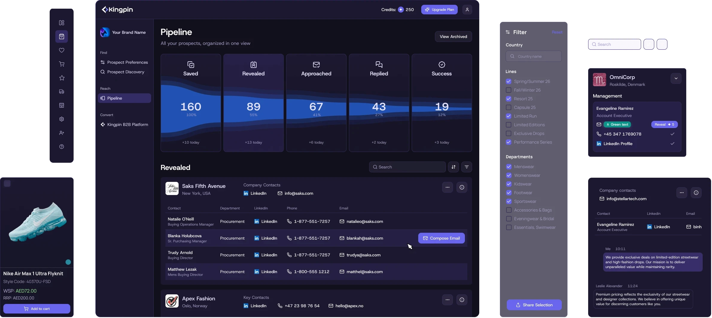
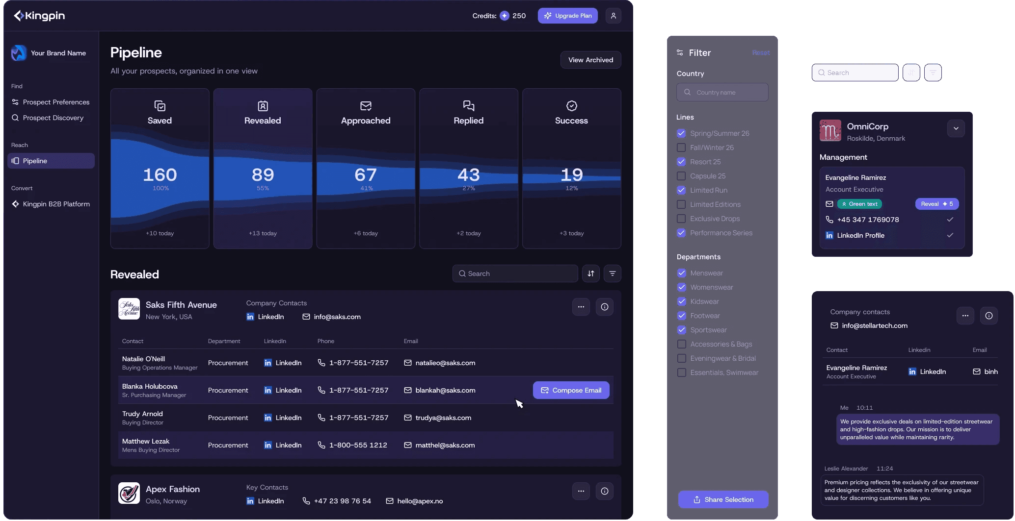
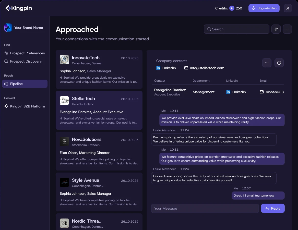
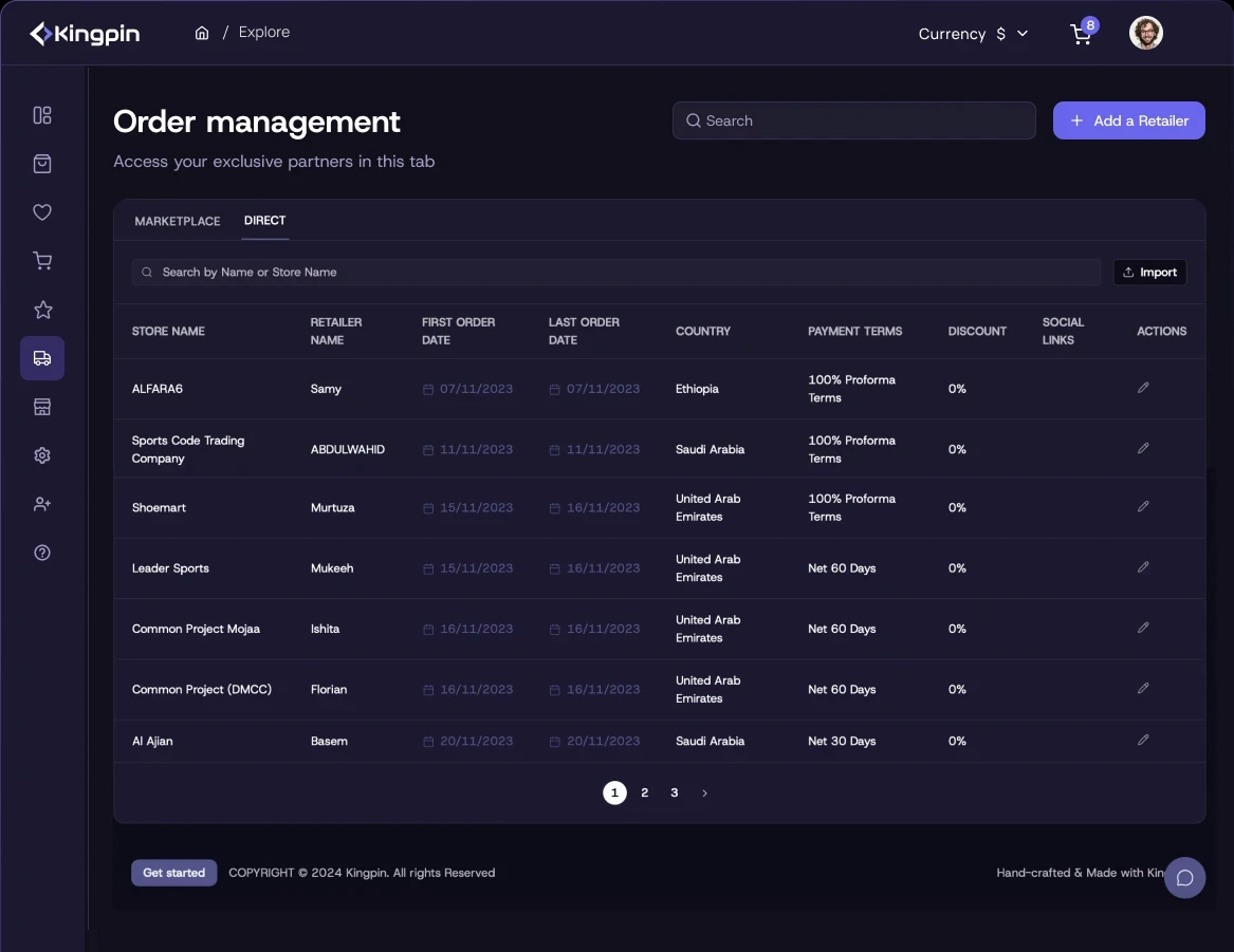
Pipeline
As described above, the core concept provides users with a simple five-step pipeline. Each step brings them closer to the final outcome: sending a message to a distributor. It must be a visualization clearly reflecting the conversion funnel, with a futuristic and fancy design.
The desktop version features cards with a dynamic flow illustration, built in a way that developers can implement with minimal effort. The cards serve as a segmented control, switching the content. An elegant and simultaneously fancy solution. Just as required.

Developers received detailed logic, including all the formulas for each element. With a handover like this, you’ll instantly become developers best friend. No jokes, designers should try it.
Developers received detailed logic, including all the formulas for each element. With a handover like this, you’ll instantly become developers best friend. No jokes, designers should try it.

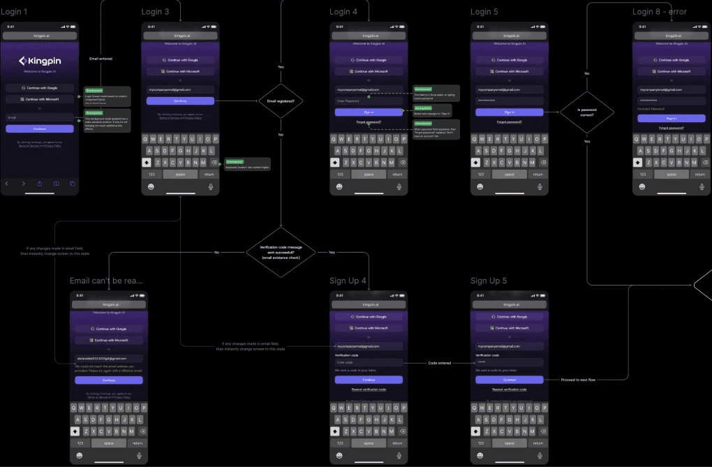
Flow visualisation ui logic
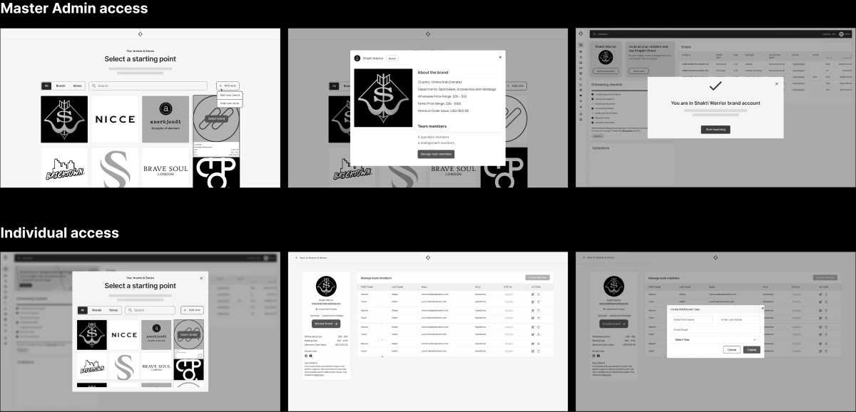
First time user experince
Newcomer experince
One trick in my arsenal is adaptive UX. It proves highly effective when built on simple logic that’s easy to implement in a product.
The challenge was delivering results to newcomers in just two clicks. Our audience research revealed their typical behavior: “Show me what I'll get first". So, we're showing a progress block with a focus on “Next” button at the top, guiding new users to the result in five clicks and showcasing the core concept.
After the first result, this block disables automatically – its purpose served, it no longer distracts experienced users. Simpley solves the newcomer problem without hindering experiences users. Win-win.

first app launch flow
Documentation
Documentation
Like most products, Kingpin required accurate documentation to reduce development costs and align the entire team with the mockups, capturing all logic and details.
Like most products, Kingpin required accurate documentation to reduce development costs and align the entire team with the mockups, capturing all logic and details.
Developers’ hours were the project’s most valuable resource, so the design files include the full user flow, covering all possible edge cases and scenarios.
Developers’ hours were the project’s most valuable resource, so the design files include the full user flow, covering all possible edge cases and scenarios.

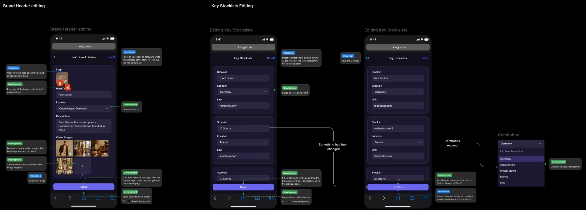
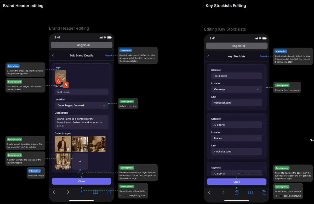
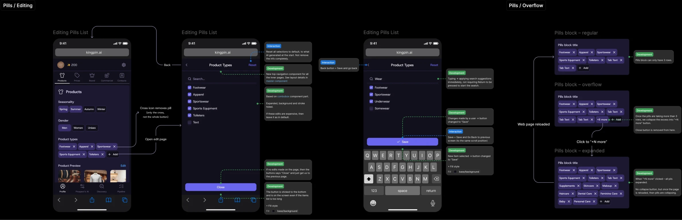
Components, controls, and UI details
Dedicated attention was given to components: every change or override of default elements was described, along with all new components.
Dedicated attention was given to components: every change or override of default elements was described, along with all new components.

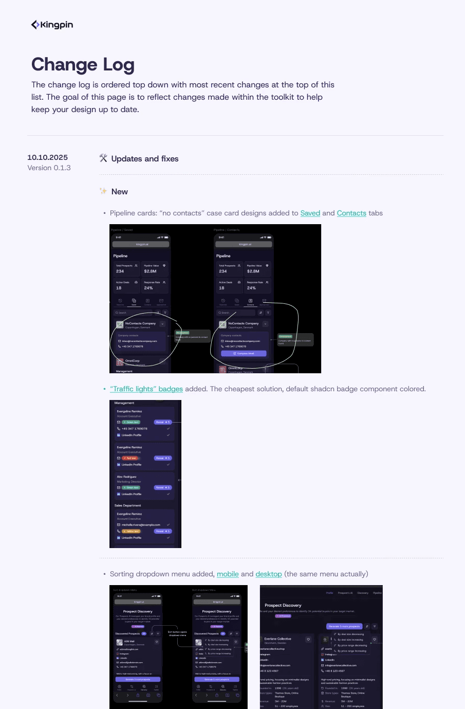
Design change log
The product was in its early stage, where rapid changes are essential, and there are usually plenty of them. Moving without a change log is possible, but it takes far more time to communicate and resolve inconsistencies between product management, design, development, and QA.
A simple hours calculation shows whether tracking changes is worth it. Despite this project’s fast pace, the change log saved significant time and reduced total dev costs.

Design System
Design System
In this project, the design system wasn’t built from scratch. After careful consideration, we chose a reshadcn as the base for .
In this project, the design system wasn’t built from scratch. After careful consideration, we chose a reshadcn as the base for .
The main advantage of our choice was open-source code and dev stack match, which is a must-have for creating unique components were planning to add.
Business and marketing requirements demanded a unique, original, and futuristic design. This necessitated creating custom components. At the same time, tight deadlines and limited development resources ruled out building a design system from scratch. The core product goal was a quick MVP with a scalable, flexible foundation.
Most of the components were left in a default state
Most of the components were left in a default state

For some I've created more variations to cover unique cases
For some I've created more variations to cover unique cases

And many unique and product-specific organisms
And many unique and product-specific organisms

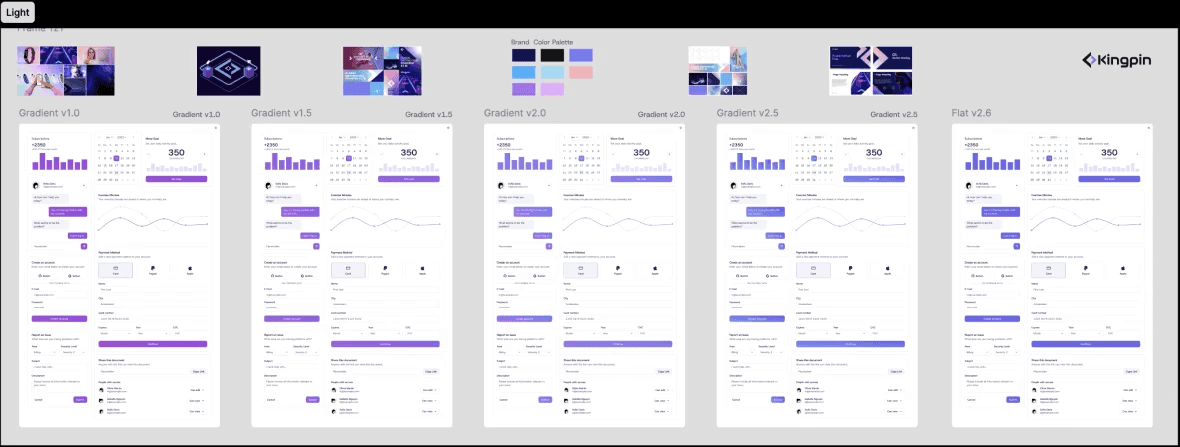
Tokenized color variables out of the box allowed us to adjust the color palette on the fly without disturbing developers at all.
Tokenized color variables out of the box allowed us to adjust the color palette on the fly without disturbing developers at all.


outro
outro
Kingpin perfectly exemplifies the founding designer role. It involved a fast-paced environment, extremely tight deadlines, limited resources, and the need to create a flexible foundation with high-quality, original UI. But at the end the goal was successfully achieved.
Kingpin perfectly exemplifies the founding designer role. It involved a fast-paced environment, extremely tight deadlines, limited resources, and the need to create a flexible foundation with high-quality, original UI. But at the end the goal was successfully achieved.